> ## Documentation Index
> Fetch the complete documentation index at: https://botpress-pb-update-api.mintlify.site/llms.txt
> Use this file to discover all available pages before exploring further.
# Cards
Cards are drag-and-drop elements that **perform tasks within a [Node](/studio/concepts/nodes)**:
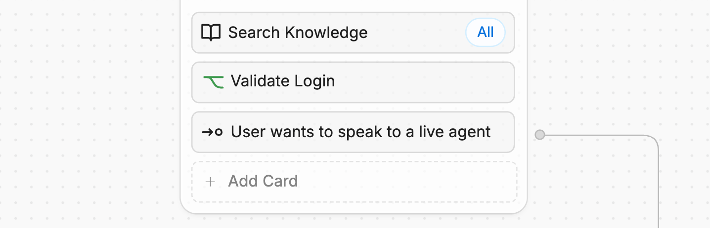
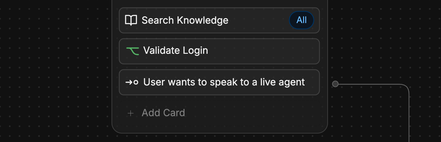 You can use Cards to:
Send text, images, and other content to users
Transition to another Workflow
Add custom JavaScript code to your Workflow
This section contains documentation for all Cards in the Studio.
## Add a Card
1. Select **+ Add Card** on any Node to open the Card tray.
2. Select any Card to add it to your Node.
Not all Cards work with every type of Node. The Card tray will only display Cards that are compatible with the Node you've selected.
When you install an integration, its Cards will become available in the Card tray. Check out the [integrations documentation](/integrations/get-started/introduction) for more information on integration-specific Cards.
## Configure a Card
You can access a Card's configuration options by selecting the Card after adding it to your Workflow. This will open the Card's inspector in the Studio's right panel:
You can use Cards to:
Send text, images, and other content to users
Transition to another Workflow
Add custom JavaScript code to your Workflow
This section contains documentation for all Cards in the Studio.
## Add a Card
1. Select **+ Add Card** on any Node to open the Card tray.
2. Select any Card to add it to your Node.
Not all Cards work with every type of Node. The Card tray will only display Cards that are compatible with the Node you've selected.
When you install an integration, its Cards will become available in the Card tray. Check out the [integrations documentation](/integrations/get-started/introduction) for more information on integration-specific Cards.
## Configure a Card
You can access a Card's configuration options by selecting the Card after adding it to your Workflow. This will open the Card's inspector in the Studio's right panel:
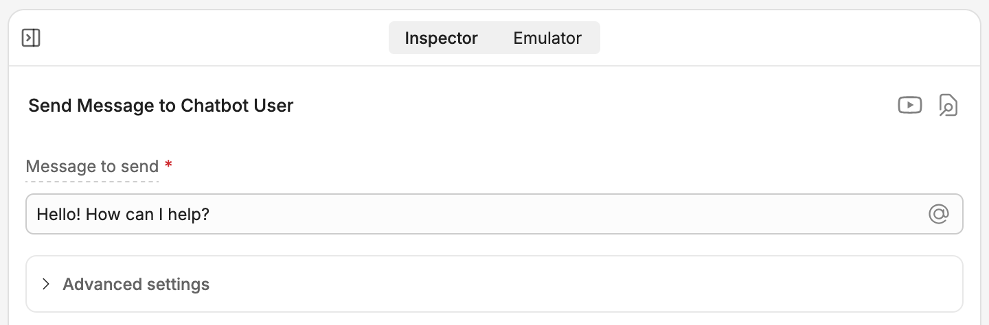
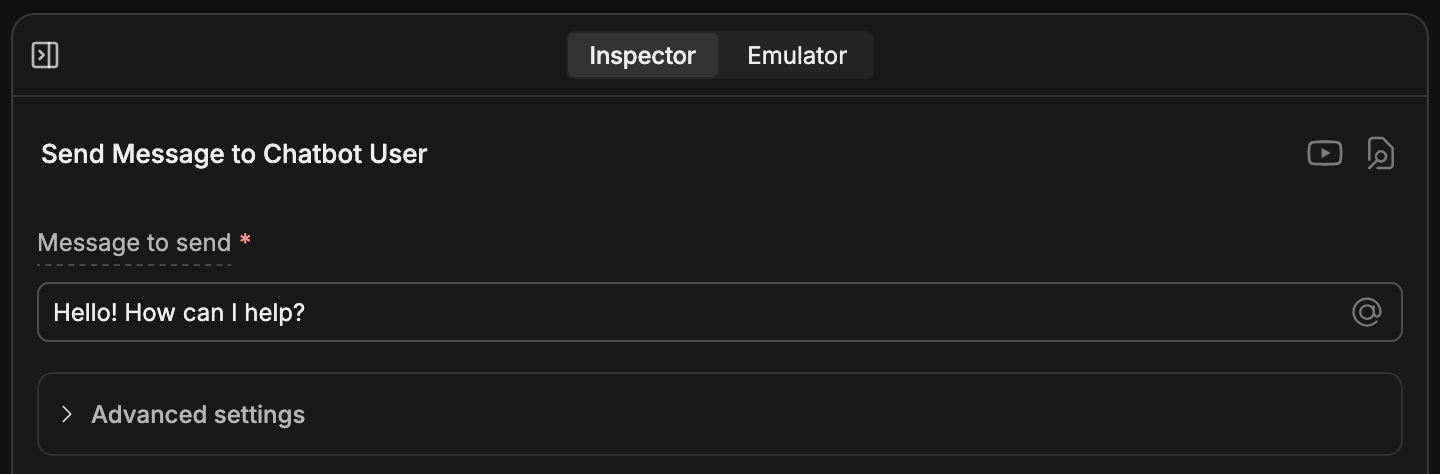 The Card's configuration fields could be either mandatory or optional—mandatory fields are marked with \*.
If no Card is selected, Studio's right panel displays the [Emulator](/studio/concepts/emulator). When a Card is selected, you can toggle between the **Inspector** and the **Emulator** tabs.
The Card's configuration fields could be either mandatory or optional—mandatory fields are marked with \*.
If no Card is selected, Studio's right panel displays the [Emulator](/studio/concepts/emulator). When a Card is selected, you can toggle between the **Inspector** and the **Emulator** tabs.